
Haylee
Creative Work
Branding - Protein Palace
Brief Description
My Protein Palace project focused on developing a cohesive visual identity for a fitness-focused food and beverage brand from the ground up. I explored the brand's personality, audience, and positioning before developing the visual direction, including logo design, typography, color, graphic elements, and supporting brand applications. The project strengthened my ability to create a brand that feels energetic, approachable, and contemporary while maintaining consistency across different visual touchpoints.


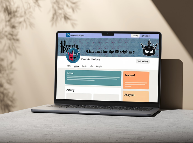
Protein Palace
Brand Identity Development
Challenge
Protein Palace was a branding project focused on creating a visual identity for a fitness-oriented food and beverage concept. The challenge was to develop a brand that communicated energy, strength, and approachability while creating a cohesive identity that could work across multiple applications.
Approach
I approached the brand by first considering the personality and audience of the business. The visual identity needed to feel energetic and recognizable while remaining flexible enough to work across digital and physical materials.
I explored typography, color, composition, and graphic elements to establish a visual language that could be consistently applied throughout the brand.
Process
I developed the brand identity through research, concept development, experimentation, and refinement. I explored multiple directions before narrowing the visual language and applying it across branded materials and mockups.
This process allowed me to evaluate how individual design decisions worked together as a complete system rather than treating the logo as the entire identity.
Final
The final identity established a cohesive visual direction for Protein Palace, including the logo, typography, color system, and supporting brand applications.
The project demonstrates my interest in creating brands that are recognizable, intentional, and flexible across different formats.
What I Learned
This project reinforced the importance of consistency in branding. A strong identity is more than a logo—it is a system of visual decisions that work together to communicate a recognizable personality.
It also strengthened my ability to think beyond individual graphics and consider how design elements function as part of a larger visual identity.